Traverse Area Northern Home & Cottage Tour
 Included in our lineup: several contemporary-chic Glen Lake homes, a river home in downtown Leland, an empty-nesters downtown Traverse City dreamhouse, an Old Mission beauty that overlooks East Bay, two 90s condos made cottage-glam and more (sneak peeks inside each home below
Gary Mott, G. Mott Builders—The Heart of Downtown (Sneak peek) 250 E. Tenth St., Traverse City
WHAT A SUCCESS STORY!
Larry and Christine Flynn thought downsizing and moving from the outer Traverse City limits to something snug near downtown would be easy. But bidding wars, scarcity of inventory, and the realities of circa 1880s shotgun houses with floor plans that no reno could fix started to sink in.
Then one day she and her husband were running on the TART trail near Oryana and peeled off to see a “for sale by owner” sign tacked in the yard just across from the community market. Sadly, the house, in pretty rough shape, was a tough salvage, and in the end the Flynns decided to rebuild something in its place, with the guiding rule that it had to fit in the existing neighborhood.
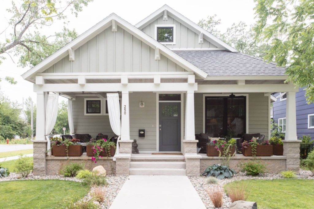
Christine thought it seemed easy—she had a floor plan and layout she loved, and had just found the perfect picture of an exterior for her dream home. But it took her three tries to find the person to bring the dream into the here and now. As soon as she brought Gary Mott of G. Mott Builders into the mix, she knew she’d found her partner for the project. “Our personal styles are very similar, so I would just intuit what she wanted by thinking about what I’d want to see in my own home,” says Gary. “It made the process actually a lot of fun.”
Working together, the builder and his client created a 1550-square-foot, two bedroom/two bath bungalow—a perfect everyday size for the empty nesters, but it had to be roomy enough to welcome three sons and their growing families. “It’s not huge,” says Flynn, “but with the layout, we can fit everybody in here and you don’t feel crammed in.” The living area is central, and a bedroom, the kitchen and an office all open onto it, negating the need for space-wasting hallways.
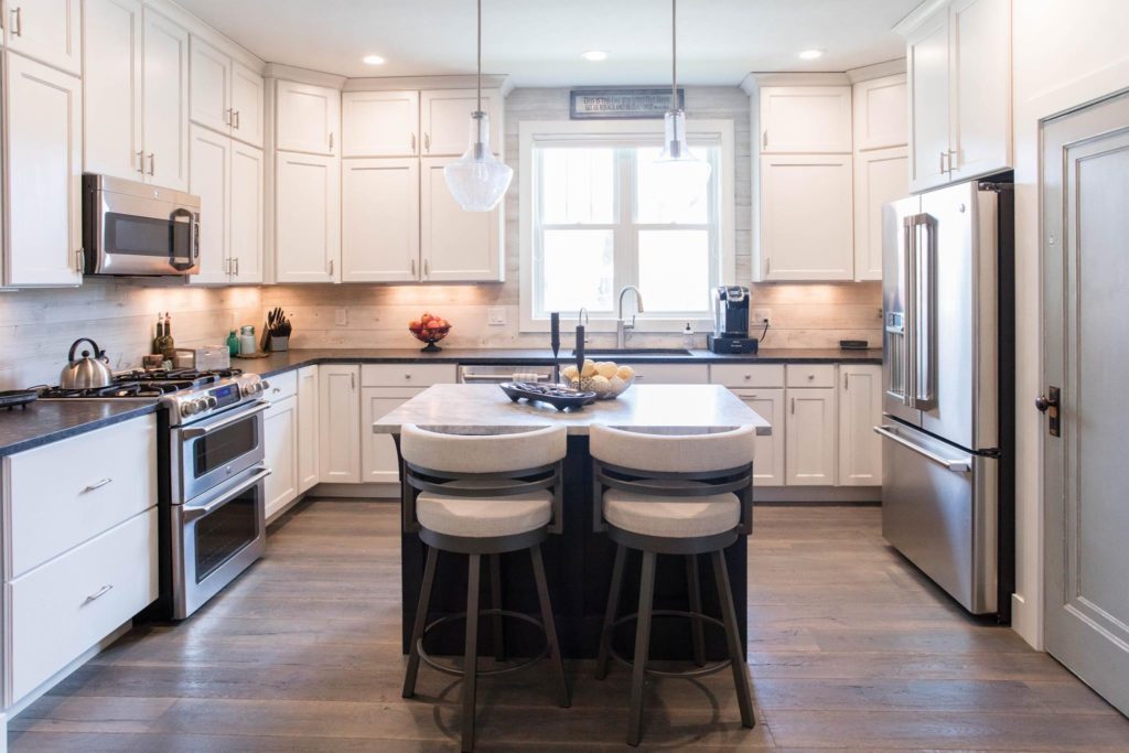
Though the home is a bungalow, the interior design is updated in a rustic refined style, with loads of custom details that add texture. White shiplap on the entry and kitchen backsplash complements the wide-plank gray oak flooring and all-white kitchen. The countertops are a mix of white pearl granite on the island, and a leathered gray-black pearl granite, done with an acid-etching treatment that gives the surface a soft, matte, more rustic feel. The pantry door was salvaged (with a fresh coat of chalk paint) from the pre-existing 1898 home, as were the foundation beams, which were cut to size and used as the fireplace mantle.
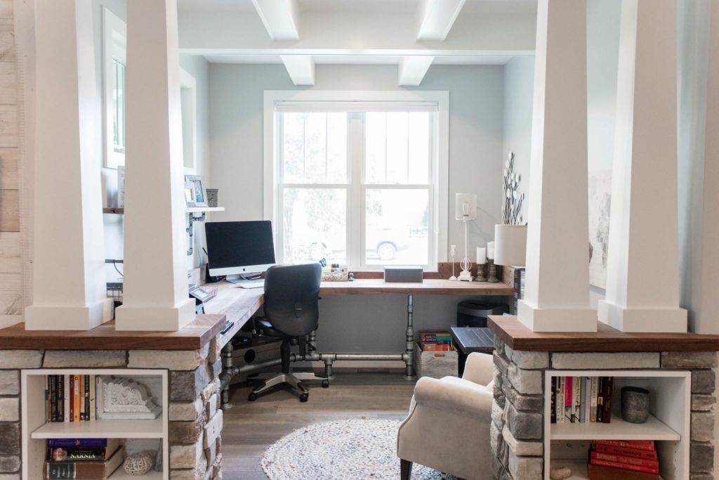
Gary’s favorite detail? The slab walnut desk, made from local trees by his favorite area sawmill that uses a circular saw for unusual rough-sawn details. The furnishings were selected from Art Sample Furniture Store with the help of designer Patty Donohue.
For Christine, the heart of the home is the deep and spacious—and classic bungalow—front porch, with two sitting areas and a wide and welcoming sidewalk leading to it (“We are the ‘come on up’ kind of porch people,” she says.) Plumbing pipe runs along the top as a curtain rod, and Flynn hung white curtains tied back to define the porch and lend an air of coziness.
The team stayed true to the Flynns’ original vision of a new home with vintage sensibilities. Proof positive is that the neighbors sat up and took notice. “The number one compliment we hear is thank you, thank you, thank you for building a house that fits right in. It looks like it could have always been here,” says Flynn.
